Farmatodo Mobile App
Helping people find products across locations
Stakeholders
Farmatodo
Project Role
UX/UI Designer
Tools Used
Figma
Adobe Illustrator
Photoshop
Midjourney
Key contributions
Competitor Analysis
User Personas
Flows
Wireframing and Prototyping
Usability Testing
Branding & Emotional Design
The challenge
Refine the Scan and Search Feature on the Farmatodo App to help people easily find products across locations
Simple Task, Human-Centered Approach
The Process
I began by interviewing new and regular users to define personas and map out user journeys. These insights informed the ideation phase, where I brainstormed and developed potential solutions. Next, I created prototypes and iterated on them through user testing.
Project Goals
The goal was to refine the Scan and Search Feature to help people easily find products across stores. The changes needed to review login, search, scan, check out and order tracking. Deliverables included a Style Guide.
Research
Understanding context & user needs
Insight # 1
All in one search
Users struggle to find available products and discounts, snd do not understand how the scan helps them search for products.
Idea: Grouping scan with search bar to indicate the feature is a searching tool. Highlight availability and discounts.
Insight # 2
Easily switching between stores
Users struggle when switching between locations to find products because it is only accessible though the profile menu.
Idea: Add a drop down menu in the home screen that allows users to change store location easily.
Insight # 3
Confirmation screens
Users reported they were surprised their orders went in without confirmation, and they could not find the order tracker.
Idea: Add a confirmation screen before checkout and display order tracking after order has been placed
The interviews helped me understand the challenges users face when trying to locate products across multiple stores.
During this process I identified a primary user group of seniors between 50 and 80 years old who use the app to locate products across stores.
With this insight I created the user persona of Raquel, who values visual accessibility features and access to organized information regarding promotions.
Ideate
From Ideas to Pixels
I focused primarily on reducing cognitive load for the search functions and maintaining consistency across prototypes by using familiar visual elements and patterns.
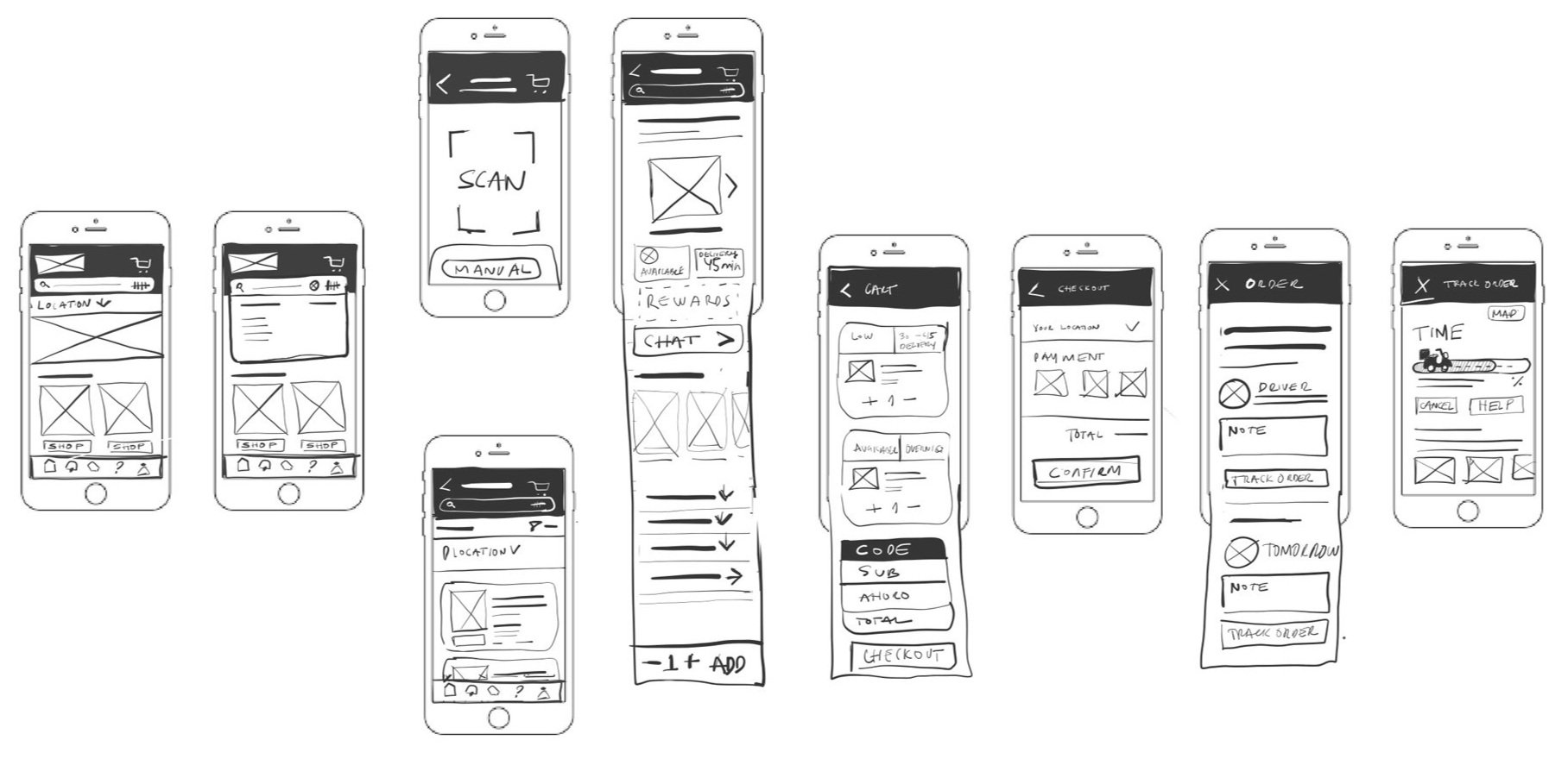
Sketching
Low Fidelity Wireframes
The hypothesis was that consolidating the QR scanner and Search Bar (a) could refine the search process.
Also I speculated that drop-down menu for location selection (b) would help users switch between stores more easily.
For the home screen, I decided to add an access to orders (f) to helps users see and track all placed orders (d).
I also added a confirmation screen before check-out (e)
Mid Fidelity Wireframes
Testing
Finding out what users think
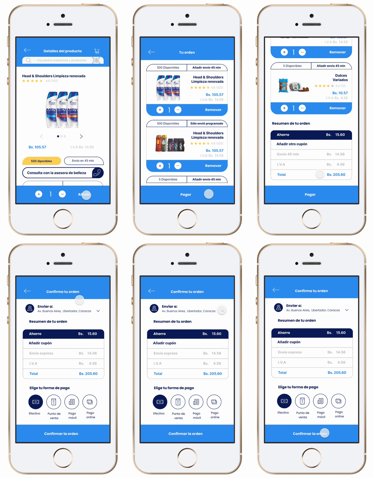
During the prototyping phase, I conducted a usability study to review Login, Search, Checkout and Order-Tracking tasks and measure for errors and task completion.

Issue #1
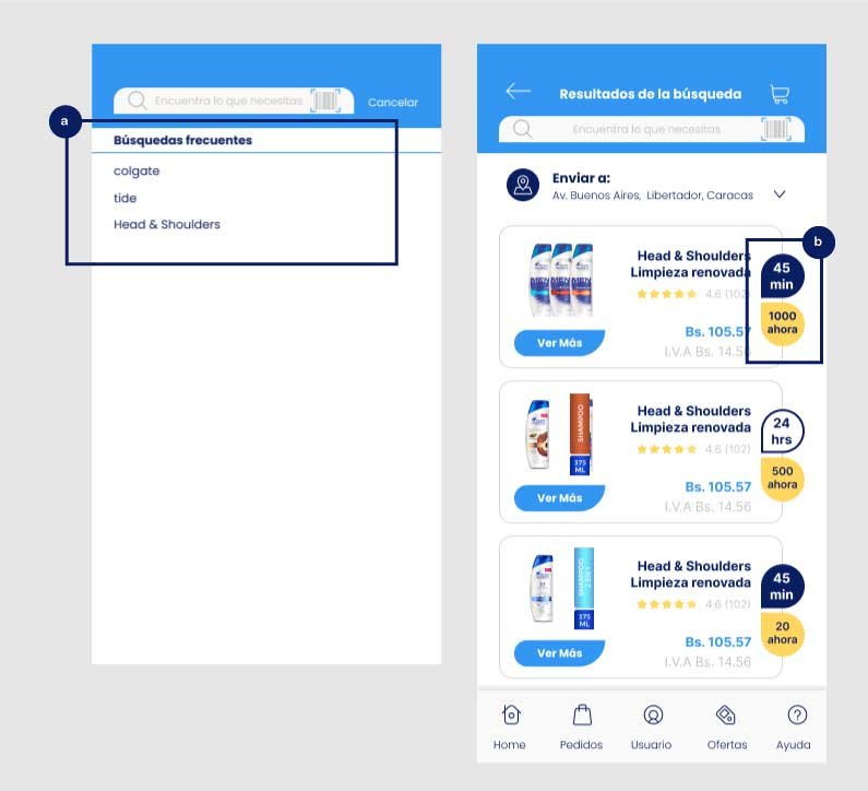
Found QR Scan but would like previously search suggestions and highlighted availability (Low)
5 out of 5 users easily found and use the scan feature on the Search Bar. 3 out of 5 reported that they often search for the same product to check availability.
So, I introduced a list of frequently searched products to the search bar (a)
And, highlighted the number of products left in stock(b), offering users better visibility on availability
Report #1
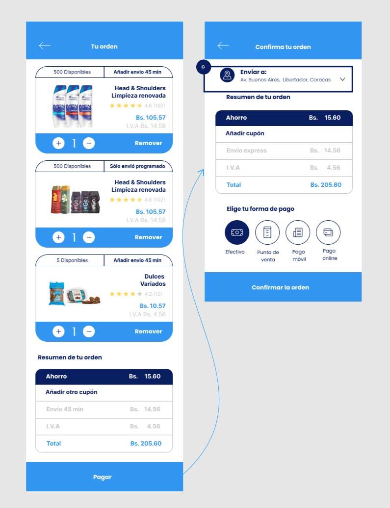
Users found helpful the confirmation screen before paying for the products
4 out of 5 users liked the incorporation of a confirmation screen before check out.
5 out of 5 users liked they could select the delivery address from a drop-down menu (c)
3 out of 5 users reported they liked they could review all their orders in a single screen (d) and track orders separately (e).
4 out of 5 users liked the progress bar to follow up on their order (g), and thought they use it to coordinate communication and updates with their drivers (f)
Report #2
Users found helpful the Your orders screen and the Tracking Screen
The Results
Error Rate
- 15 %
reduction
Tasks Completion
20%
improvement
Style Guide
Dressing for the part
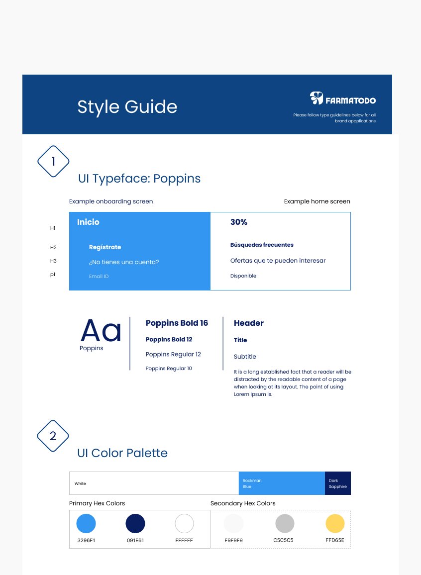
My goal was to establish a cohesive UI design system that preserved the brand's traditions and attracted loyal customers to embrace the digital shopping experience.
I decided feauture the flower petals as inspiration for various design elements, including bottom outlines and promotion highlights. I also brought in the yellow shades, traditionally used to highlight discounts on their printed catalogs, to serve as a visual bridge for customers transitioning from print to digital.


