Caracol
From Lo-Fi to High-Fi prototypes
Overview
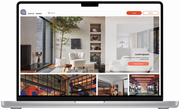
Caracol is an app that connects home decor enthusiasts with professionals, to simplify the process of personalizing living spaces. Throughout the prototyping phase, we leverage low-fidelity prototypes to refine our core functionalities—logging in, searching for professionals, creating project boards, chatting, and booking consultations. This foundational work informed our more detailed designs like a separate professional dashboard, enabling us to meet the needs of our users—both "Kates" (professionals) and "Trinis" (homeowners and renters)—with greater precision and efficiency.
Research Question
How can we facilitate the process of finding and booking home decor professionals to make the process of personalizing living spaces easy?
Design Method
What methods have you used to reduce the cognitive load for your users?
In the development of Caracol, reducing cognitive load was a key focus to enhance user experience. To this end, I applied heuristic principles of consistency throughout all prototypes. By using visual elements in a predictable manner and employing recognizable patterns common in other products, users can navigate the app with familiarity and ease.
As we progressed to higher fidelity prototypes, I emphasized visibility and user control, ensuring that users always feel they have command over their interactions within the app.
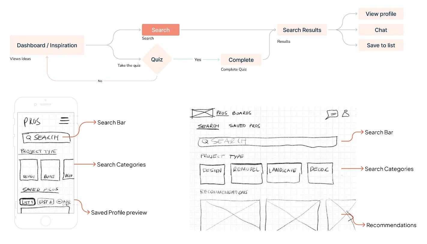
Evolution of Design: From Low Fidelity to High Fidelity
Low - Fidelity
Consistency in Design
Simple layouts and a visually-oriented interface cater to our user personas' preferences, enhancing familiarity and reducing cognitive load.
Login and search functions use recognizable patterns to facilitate ease of use and adoption, particularly for busy users like 'Kate' who are constantly on the go.
Content-heavy screens such as Home and Project Boards group related elements through vertical and horizontal movements, aiding in clearer and more intuitive navigation.
Consistent use of buttons and typography across all screens ensures a uniform user experience.

Mid - Fidelity
Visibility & User Control
Basic controls were refined to make them visible at all times.
Visual cues like icons and hovers were added to highlight active or interactive elements.
Language was introduced to make information and actions predictable for users.
Clear Exit and Navigation Options enables uers to leave functions or pages without confusion
Flexible User Paths support multiple ways to achieve tasks.
-
![]()
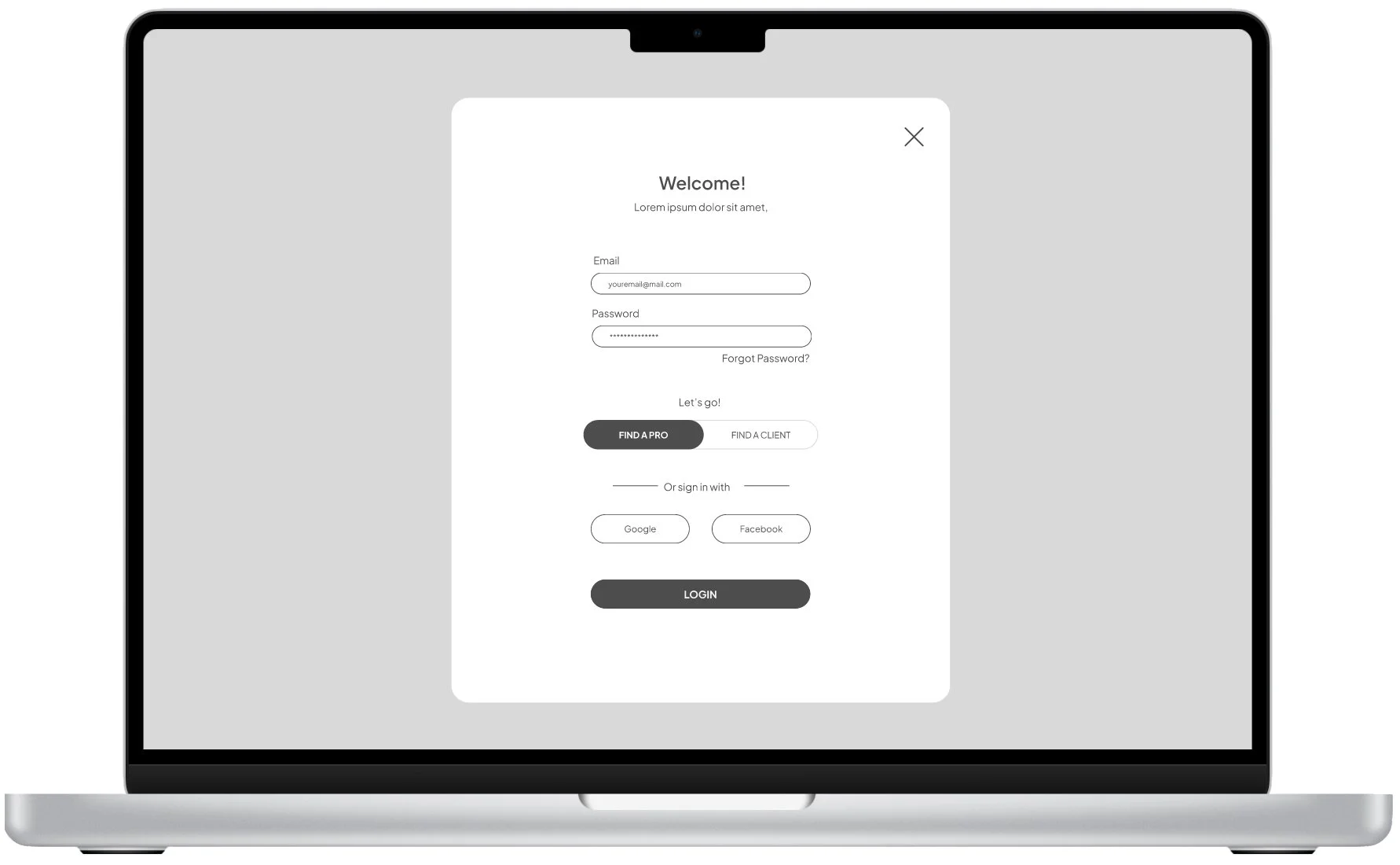
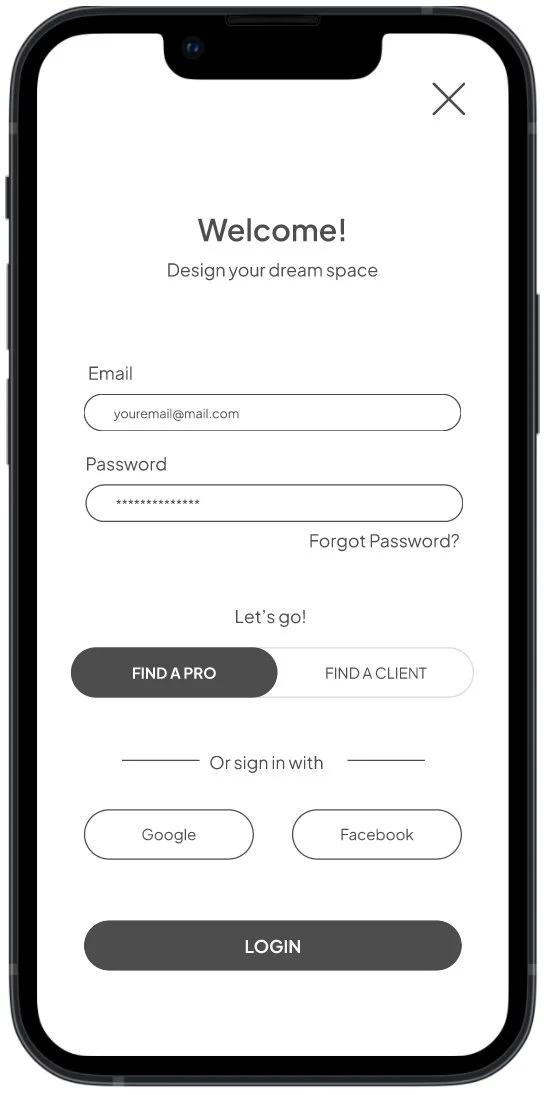
Login
Login begins with an action on the unlogged dashboard. Users can then input their email and password or opt for social login via platforms like Facebook or Google. Finally, a selector allows users to choose their account type depending on weather they are looking for a pro or looking for a client.
-
![]()
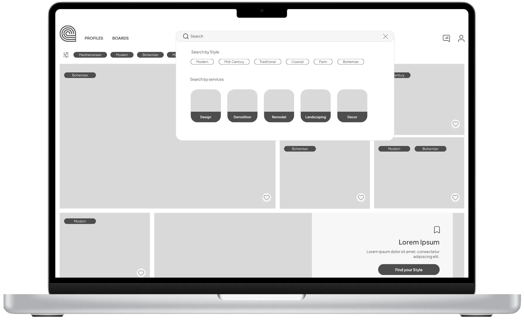
Search
Users can access the search fuction from the top bar. Upon click a drop down shows search options, or users can type their search to access results.
-
![]()
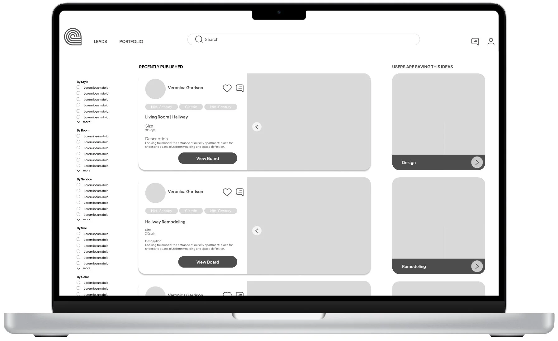
Saved profiles
In profiles is where users can review again all the professional profiles they have previously saved.
-
![]()
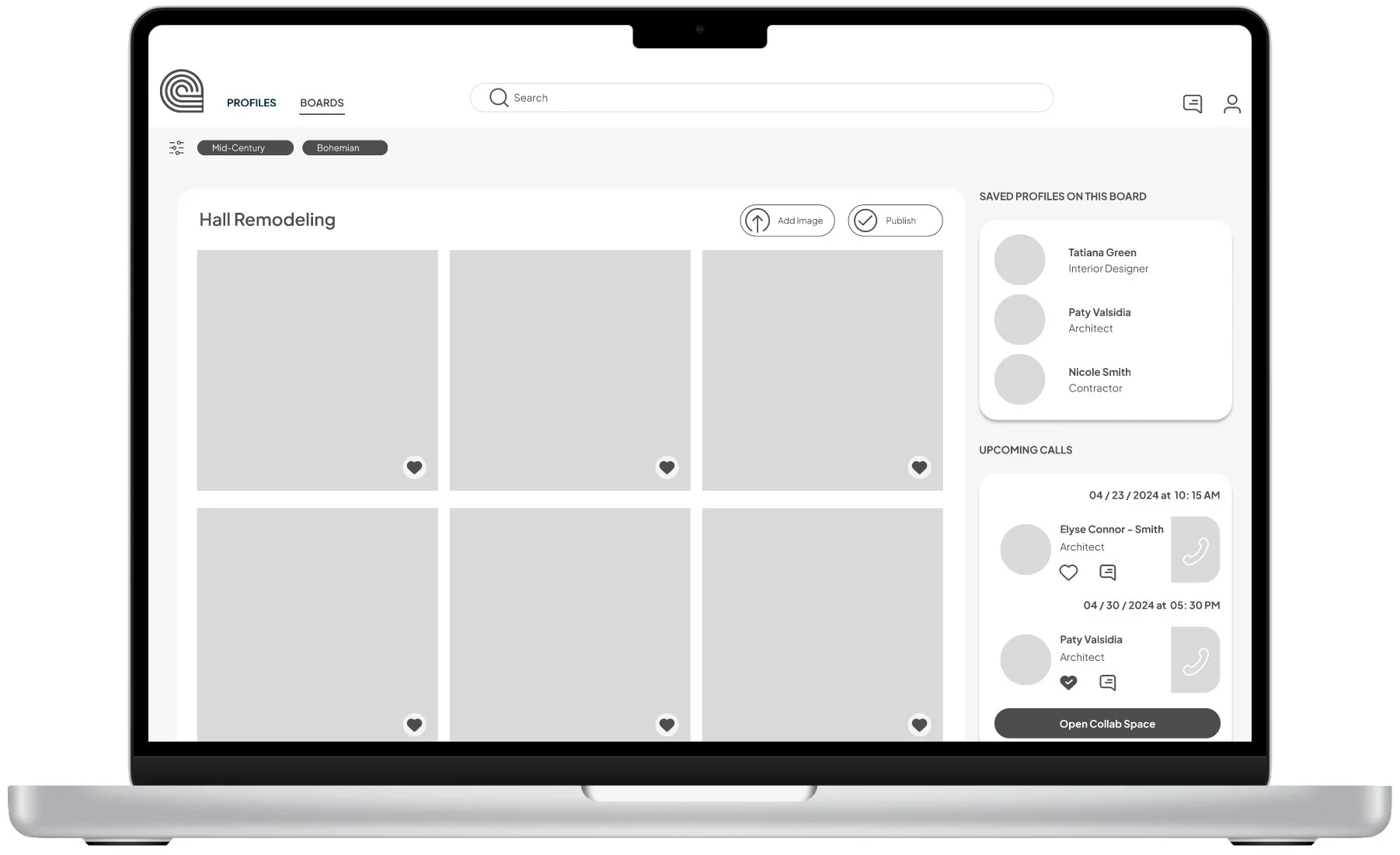
Saved Inspiration: Boards
Project boards help users keep track of their project. Here they can review inspiration, upload their own images, see their upcoming appointments, professionals they think could help them with a specific project and also publish their project so professionals can reach out to them with suggestions.
-
![]()
Bookings
Users choose a time and date to meet with a selected professional and pay for their time.
-
![]()
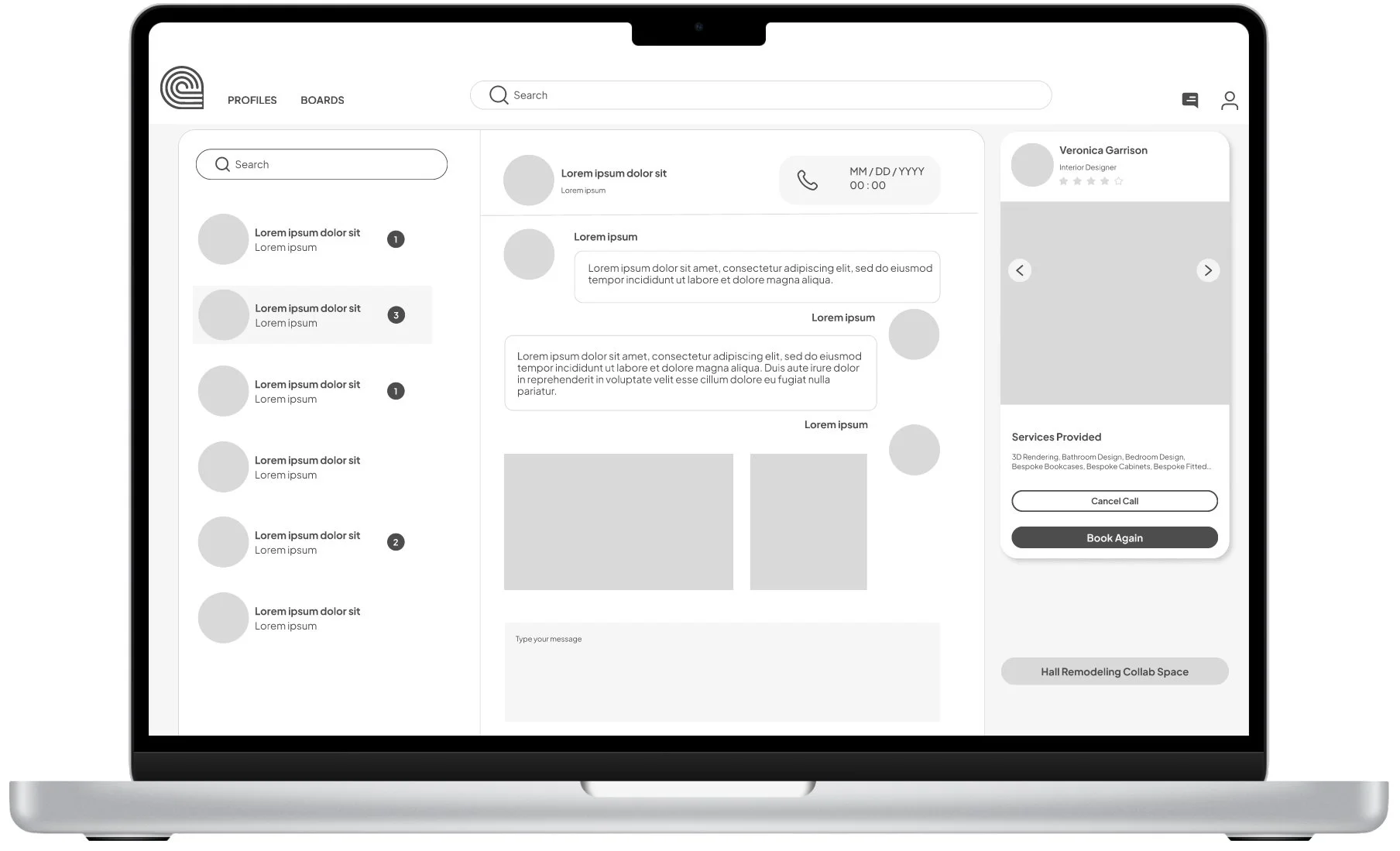
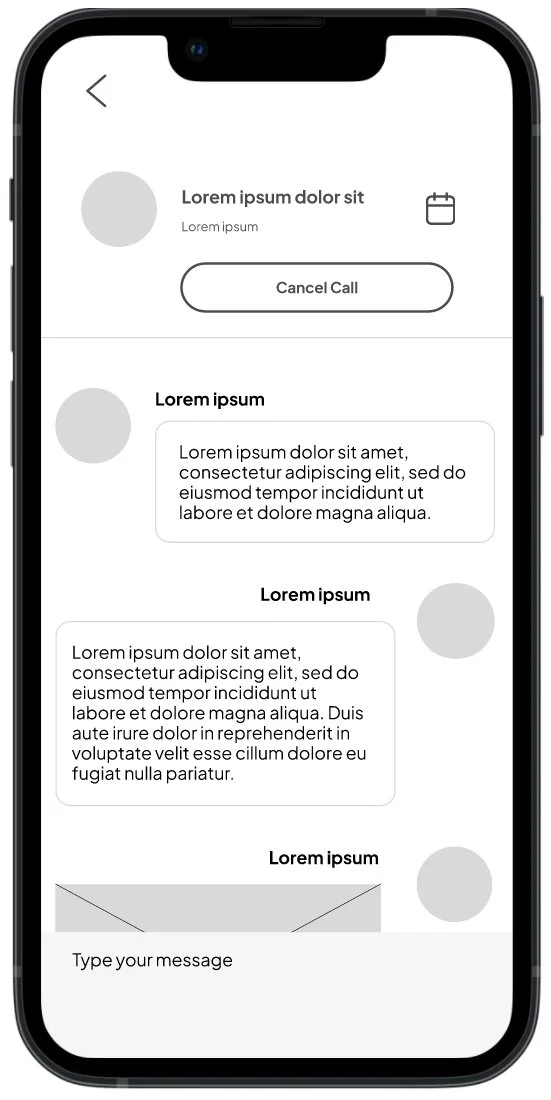
Chat
Users can reach out to professionals in advance or after booking.
-
![]()
Profesional Dashboard
Professional Login to allow our Kates to find new clients and projects. There users can searched published projects, respond to chats and take bookings. Function to be further developed at a later time
-
![]()
Mid Fidelity Desktop Prototype


-
![]()
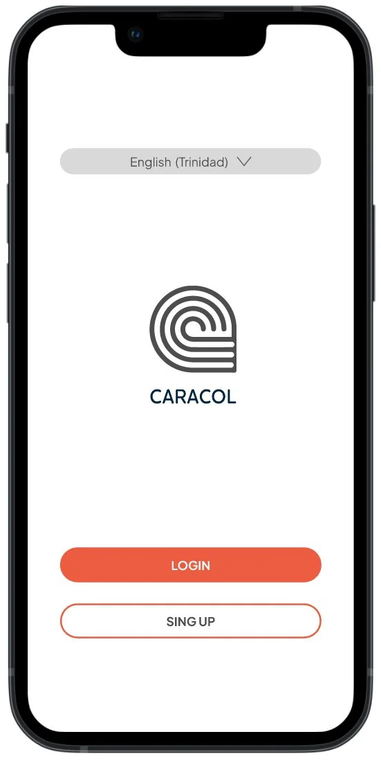
Login
Login begins with a splash screen, followed by a Login / Sign up screen with a language selector. Users can then input their email and password or opt for social login via platforms like Facebook or Google. Finally, a selector allows users to choose their account type depending on weather they are looking for a pro or looking for a client.
-
![]()
Search
Similar to desktop users can input a search word or select from the provided categories.
-
![]()
Browse
In mobile I integrated Inspiration, Profiles and Boards into a single screen with a toggle feature to facilitate naviation.
-
![]()
Book
In mobile bookings is divided into smaller screens to asure clarity.
-
![]()
Chat
As in Desktop, users can use the chat feature to reach out to professioals before or after their bookings.
-
![]()
Mid Fidelity Mobile Prototype


High - Fidelity
Refining Visual Design
Adding emphasis through color and images while making sure similar functions retain consistency create hierarchy and help user navigate and process information.
Explore some of this decisions on the Style Guide

High Fidelity Desktop Prototype
High Fidelity Mobile Prototype
Key takeaways
Anticipating User Feedback
I tried to tailored initial prototypes to cater to the distinct needs of Kate and Trini. For Trini, I aimed at a visually engaging gallery layout to simplify navigation and enhance the browsing experience, based on his need for visual inspiration. For Kate, I started to develop the professional dashboard to streamline her professional workflow and daily operations.
I feel on thing left unexplored was the language selection in desktop, perhaps under the hypothesis that a more visual interphase would help a little bit, but as we move forward it will be important to review language features.
Prototyping hypothesis
Design Flexibility
Building flexibility into the design from the start, help me recognize that Kate and Trini may have different technological proficiencies and requirements. For example, Kate might need to access the app across multiple devices during her day so the interface had to adapt to different screen sizes and contexts.
I wanted to allow the user flexibility across devices but it also open for me questions about the disparity of experience between desktop and mobile. Is this strategy helping user or are they unnecessary?

Validating Design Assumptions
I structured the search functionality with both text and visual filters, anticipating that this dual approach will cater effectively to both personas' needs—Kate for specificity and Trini for visual appeal. I think validating this hypothesis during user testing will help refine the search function.
Final thoughts
My design process began with a competitive analysis, drawing inspiration from existing apps industry related apps like Heavenly and Houzz, but also from products like Instagram and PlayStation, from which I identified effective patterns and innovative design solutions. Platforms like Dribbble were also helpful for exploring alternative creative approaches, contributing to the identity of the product. However, it was also crucial to selectively integrate these inspirations, ensuring they align with our specific user needs and product context. For instance, while some visual elements from Instagram are adapted for their simplicity and user engagement, certain complex gamification features from PlayStation are omitted to maintain our focus on usability and relevance to our target audience. This selective approach helps avoid overwhelming users and keeps the interface intuitive and focused.

Initially, we map out core functionalities against user goals outlined in the brief, such as ease of accessing expert advice, which directly caters to our personas—Kate and Trini—who need fast, reliable expert interactions. Each prototype iteration was evaluated on its ability to simplify the user journey from logging in to scheduling a call with an expert. For instance, we specifically check if the navigation leads Trini smoothly from posing a question to connecting with an professional.
How would you figure out whether your prototype does what it’s supposed to?
Did you draw inspiration from existing apps? How did this inspiration influence your work?