Farmatodo
Venezuela & Colombia
Pharmacy & Delivery Service App

Role
Product Design: Responsibilities included, wireframing, prototyping, and UI design.
Tools
Photoshop
Illustrator
Figma
Farmatodo is a prestigious pharmacy and mixed market chain catering to the customers' needs in Venezuela for more than 104 years. Boasting an expansive presence of 167 stores, Farmatodo has firmly established itself as a reliable and well-regarded brand within the country. In the early 2010s, the company pioneered implementing and developing a mobile e-commerce solution that granted customers convenient access to a vast selection of products from the comfort of their own homes. 10 years on, they want to refresh the mobile e-commerce app's user interface and review the user experience for the search and check-out features.

Departing from the original interface, provide a simple way for customers to locate and order relevant products and offers across stores.
The problem
The goal
Understand users' challenges when searching for relevant offers and products in the current interface to facilitate navigation and checkout.
After conducting interviews with customers, sales reps, and other stakeholders, I gathered the following problems on the current app:
Grouping features like the search bar and "scan me now" would be beneficial to make searching more convenient.
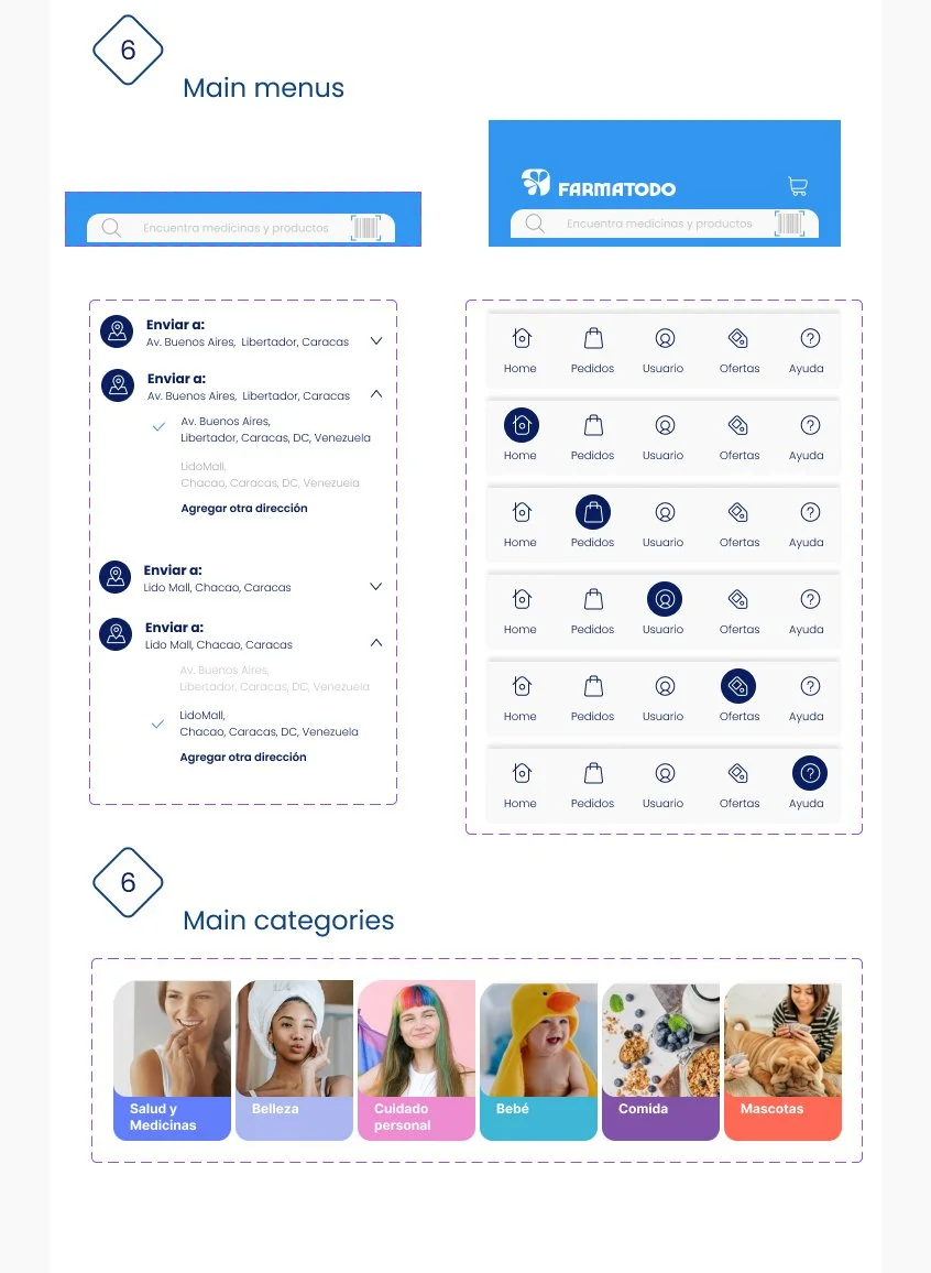
Improving the accessibility of preferred location features is essential. Currently, it is only accessible through the user profile menu, and users struggle when switching between locations to find products.
To improve the checkout process, adding a confirmation screen before checkout and providing an easy way to manage deliveries would be beneficial.
Current status assessment

Affinity Diagram
Challenges
As a well-established family business, Farmatodo aimed to turn itself into the number one full-service drug store chain in Venezuela, similar to CVS in the US. At the time, the client's priority was to ensure customers could easily access real-time product availability, discounts, and price updates on all locations. Achieving this objective required close collaboration with the developing team to integrate multiple platforms across stores nationwide. Additionally, I aimed to streamline navigation through the high volume of product promotions, enhancing the overall user experience.
I conducted interviews and created user personas to empathize with the users and understand their needs. Through research, I identified a primary user group of seniors between 50 and 80 years old who use the app to locate products across stores.
This user group confirmed initial assumptions about the Farmatodo App customer base and revealed that a large number of users also value visual accessibility features and access to organized information regarding promotions.
User Research

Value proposition
I believe there are many valuable aspects to the original app design, but I think there is an opportunity to improve the user experience by finding other ways to highlight product availability and discounts, changing the delivery address quickly, redesigning the search bar, and simplifying the checkout and delivery process.
Sketching
By utilizing the wireframe, I generated rapid concepts and integrated ideas to form designs and prototypes. Assessing the wireframe pages during the prototype usability test allowed me to collect user feedback prior to advancing to the creative production process.
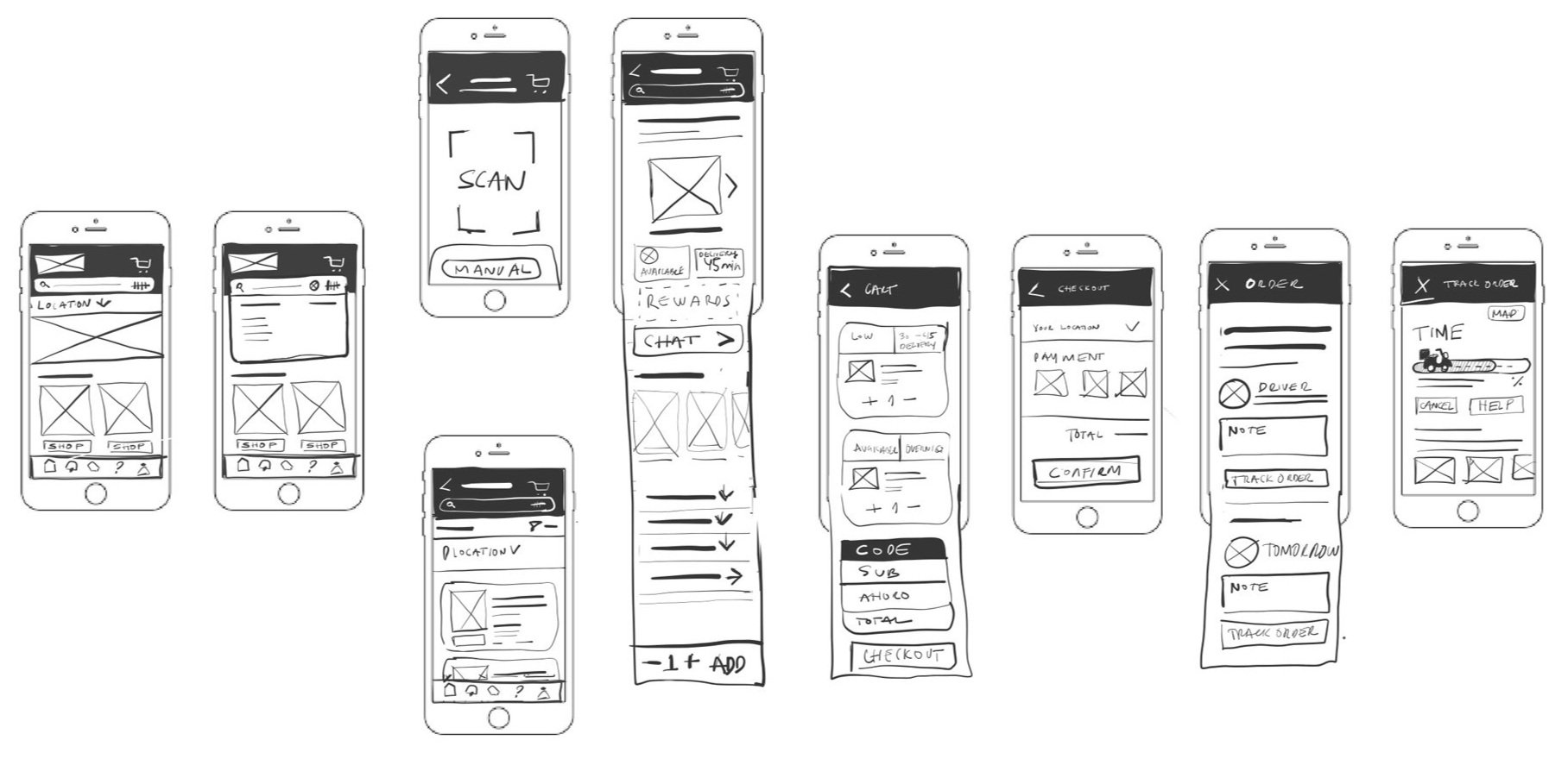
Low Fidelity Wireframes

The goal was to implement a faster search feature by integrating the scan QR feature into the search bar (a). I also added a drop-down menu for location selection (b) so the user does not have to navigate to different menus.
For the home screen, the goal was to have personalized dynamic content based on previous searches and purchases (c). I also added a home menu access to the tracking screen (d) for easy access.
To improve the check-out process, I added an order confirmation screen where users could review the products before check-out (e), and on the check-out screen, I created a layout that allowed you to see all different orders and different delivery times (f)
Usability testing
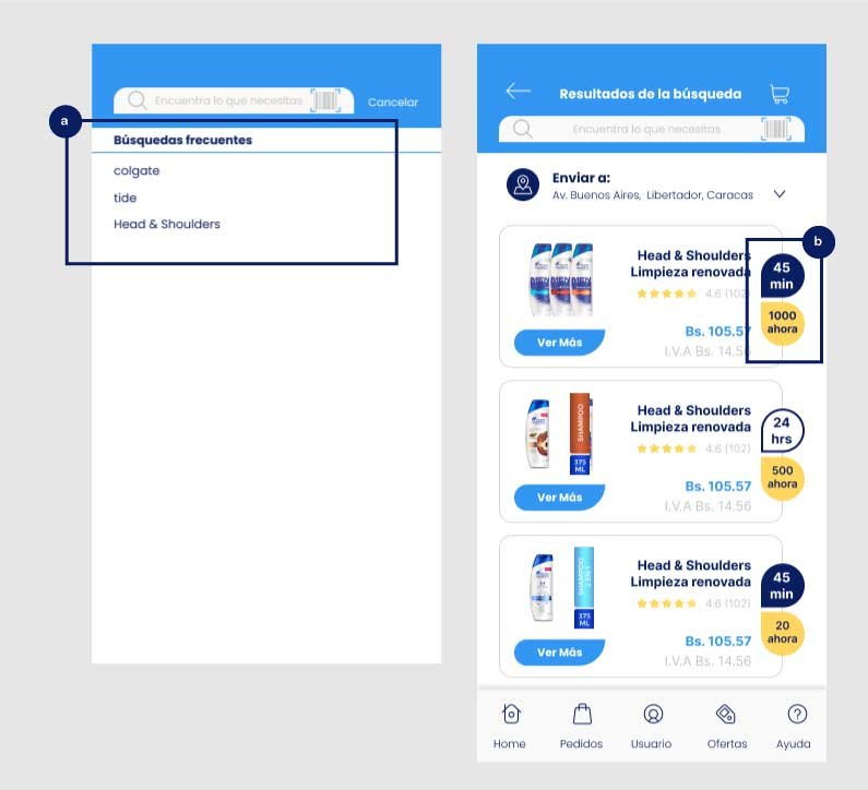
During the prototyping phase, I conducted a usability study to review the checkout and order-tracking tasks. 3 out of 5 users reported often searching for the same product to check its availability. So, I introduced a list of frequently searched products to the search bar (a) to address this issue. Additionally, I highlighted the number of products left in stock, offering users better visibility on availability (b)

During check-out, 4 out of 5 users liked the incorporation of a confirmation screen where orders can be reviewed and the delivery address selected from a drop-down menu (c)
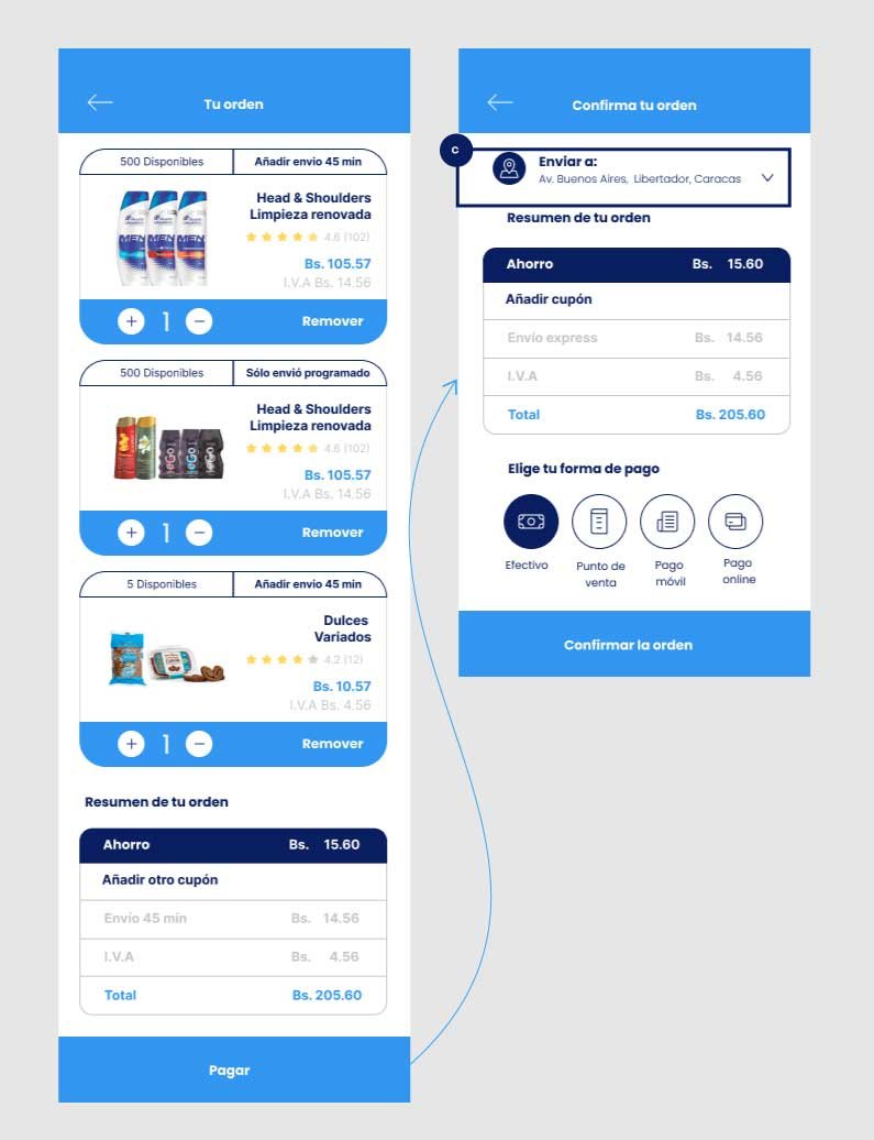

After Check-Out, 3 out of 5 users reported they liked they could review all their orders in a single screen (d) but track orders separately (e).
4 out of 5 users liked the progress bar to follow up on their order (g), and thought they use it to coordinate communication and updates with their drivers (f)

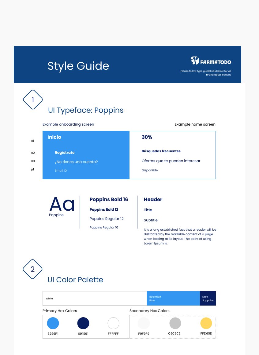
Style Guide
Famatodo's look and feel revolve around delivering a joyful and relaxed shopping experience. For more than a century, they have used blue hues to instill a sense of reliability and trust among their customers. Similarly, yellow shades in their printed coupon catalogs have traditionally been employed to highlight discounts and offers, serving as a familiar connection for customers transitioning from print to digital space.
The logo, featuring flower petals, served as an inspiration to create various design elements, including bottom outlines and promotion highlights. My objective was to establish a cohesive UI design system that preserved the brand's traditions and attracted loyal customers to embrace the digital shopping experience.


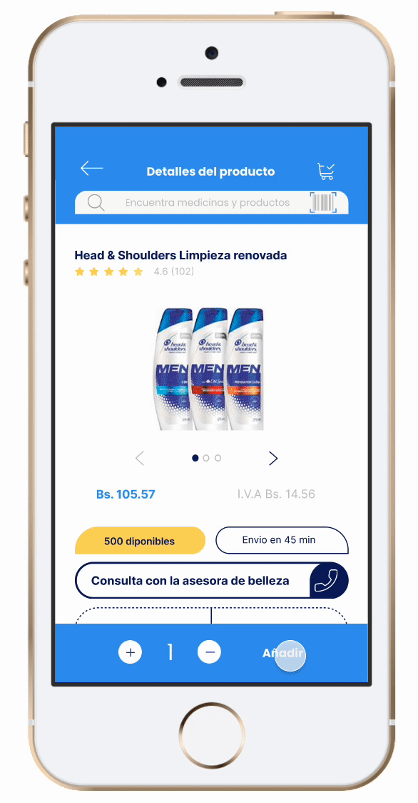
High Fidelity Wireframes


Recommendations
I thinkmissed a couple of opportunities to advocate for a shift in focus towards UX research with the client. Despite this, I did recommend ways to address usability issues during the presentation, suggesting that more extensive UX research could benefit their future steps. After the project, the client found value in the screens and user flows, using them to using them to guide the product direction.